Brand identityClient project
Cosa Nostra
A visual identity for a London strength and conditioning club. Two complete directions, one locked.
A club built on turning up and doing the work needed an identity with the same posture. The first direction was built out across 28 pages before it became clear it was solving for a running club. The second one was right.
- Role
- Delivered by Shipyard. Brand strategy, identity design, two full directions, guidelines and master artwork.
- Timeline
- 2026
- Delivered
- Four marks, 28-page guidelines, 20 master files

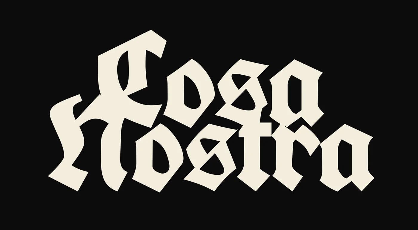
The Interlock, primary wordmark, set in UnifrakturCook 700
- Complete directions developed
- 2
- Pages of guidelines for direction one
- 28
- Marks in the final family
- 4
- Master files delivered
- 20
The brief
An identity with the club's posture
Cosa Nostra is a London strength and conditioning club for people who treat turning up as the minimum.
The club runs structured training plans and weekly sessions, and its own positioning is blunt: family over following, not a content channel. Members are there to train, and the identity had to feel like it belonged in the room with them.
The category default points the other way. Fitness branding tends towards wellness language, rounded marks and reassurance. This identity had to reject that without tipping into the other cliché, aggressive gym graphics.
Direction one
A track-club system, built out in full
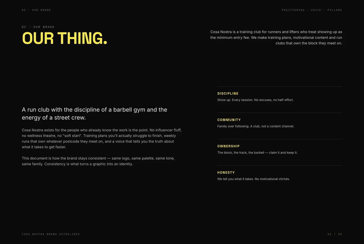
The first direction took its mark from the running the club does, and was specified across 28 pages.
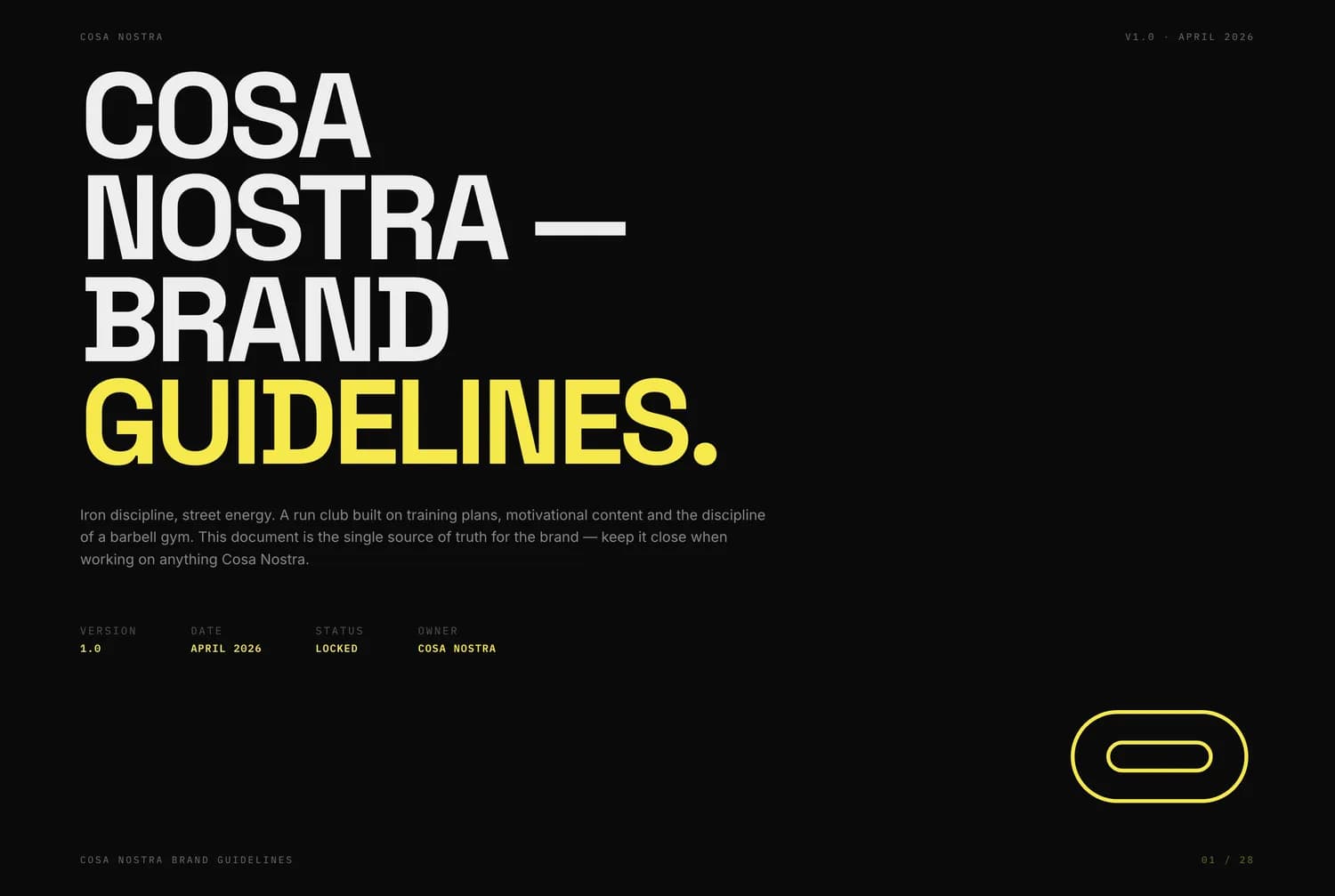
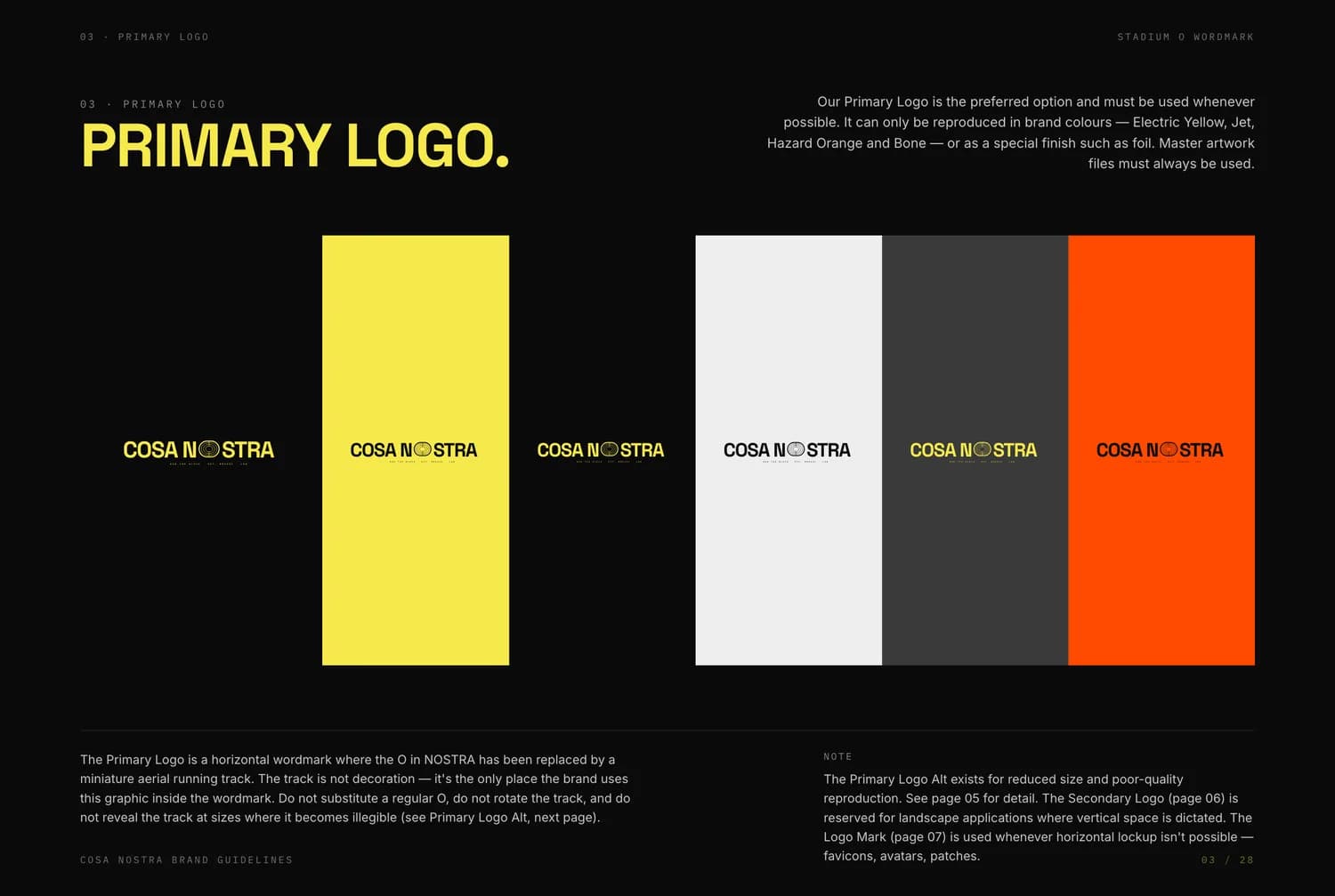
The O in NOSTRA became an aerial running track, a device used once and never decoratively. The stadium lanes were then lifted out of the mark to work as pattern and texture.
Around it sat a five-logo family with clear space and minimum sizes, a locked five-colour palette, a three-family type hierarchy, a 48 by 48 icon grid, and a social system split into training, session and brand posts with fixed templates for each.
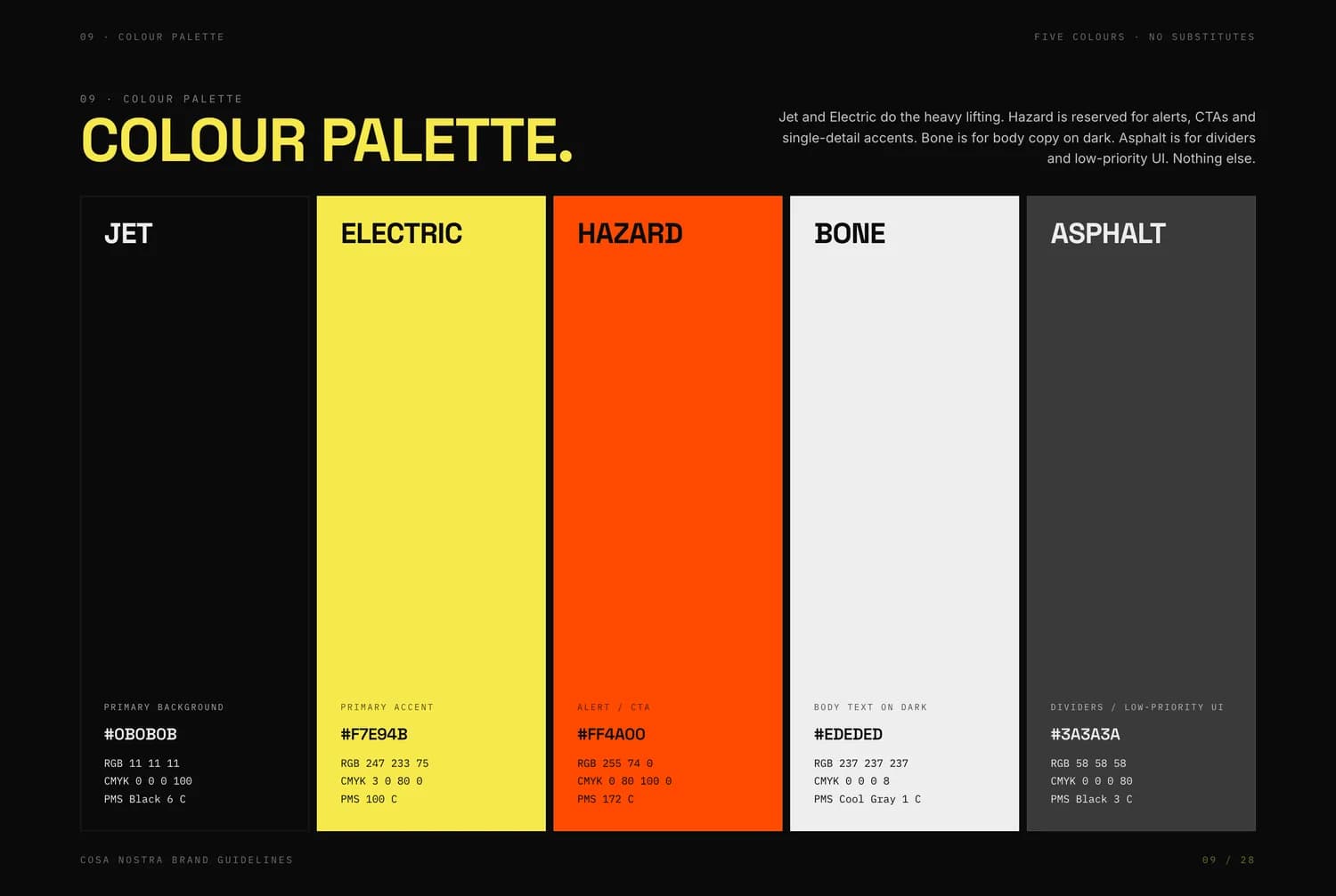
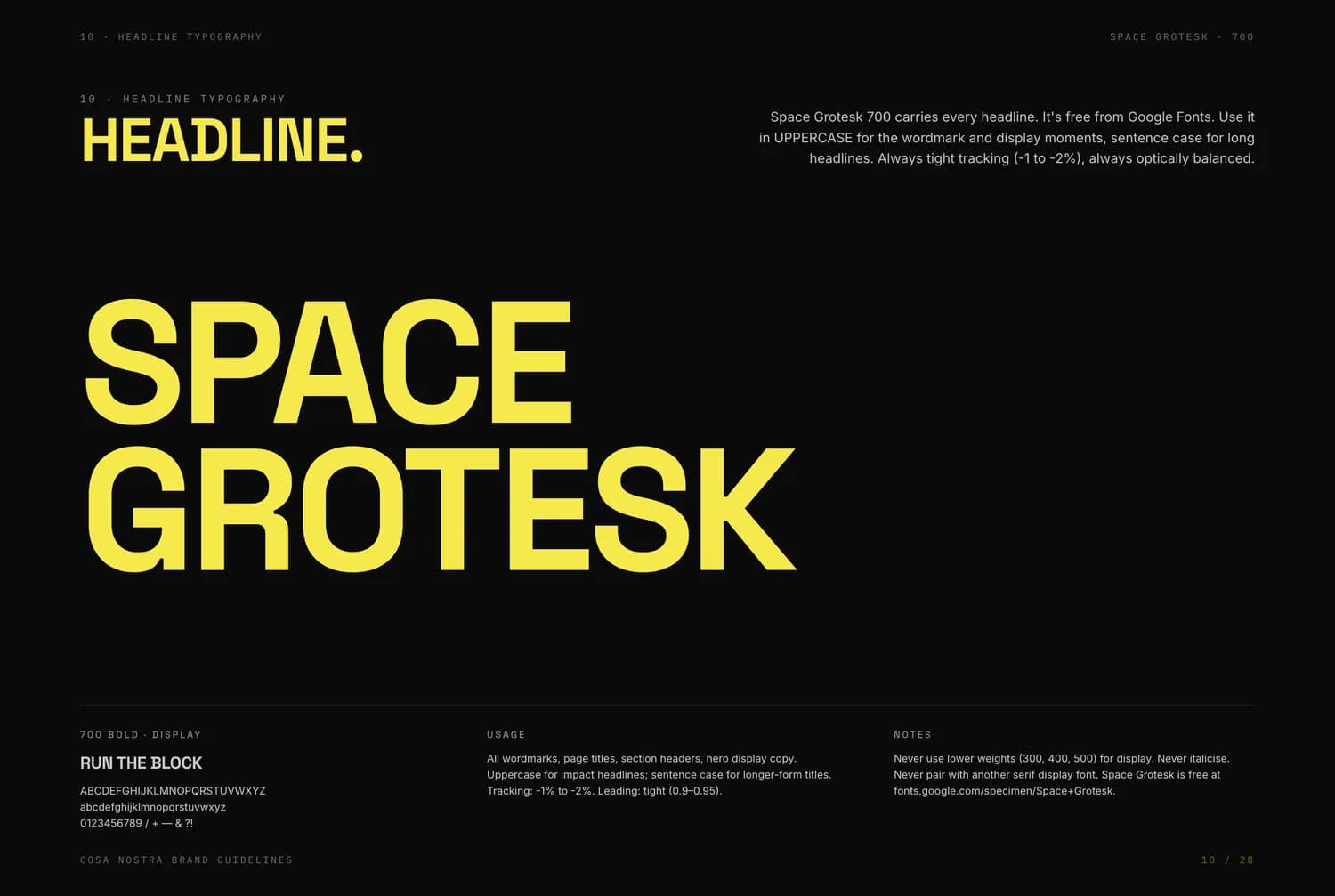
Direction one palette
- Jet#0B0B0BGround
- Electric#F7E94BAccent
- Hazard#FF4A00Alerts and calls to action
- Bone#EDEDEDBody on dark
- Asphalt#3A3A3ADividers
Applications
Pressure-tested on what the club makes
Apparel, patches, race bibs, posters, merchandise and signage were all specified with placements, sizes and finishes. The simplified mark exists because the full one cannot survive embroidery.
These pages come from the guidelines document. They show how the system applies and do not show manufactured goods, print runs or installed signage.
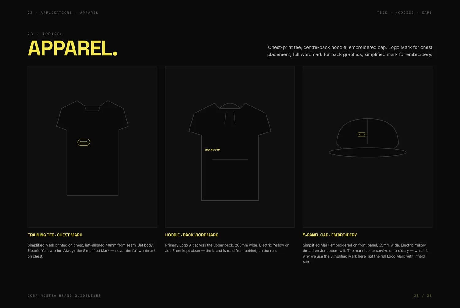
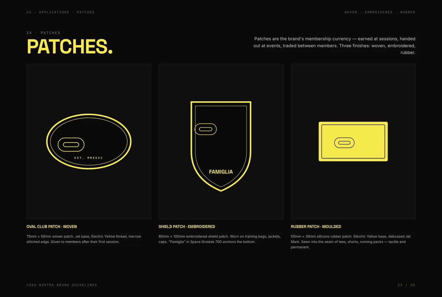
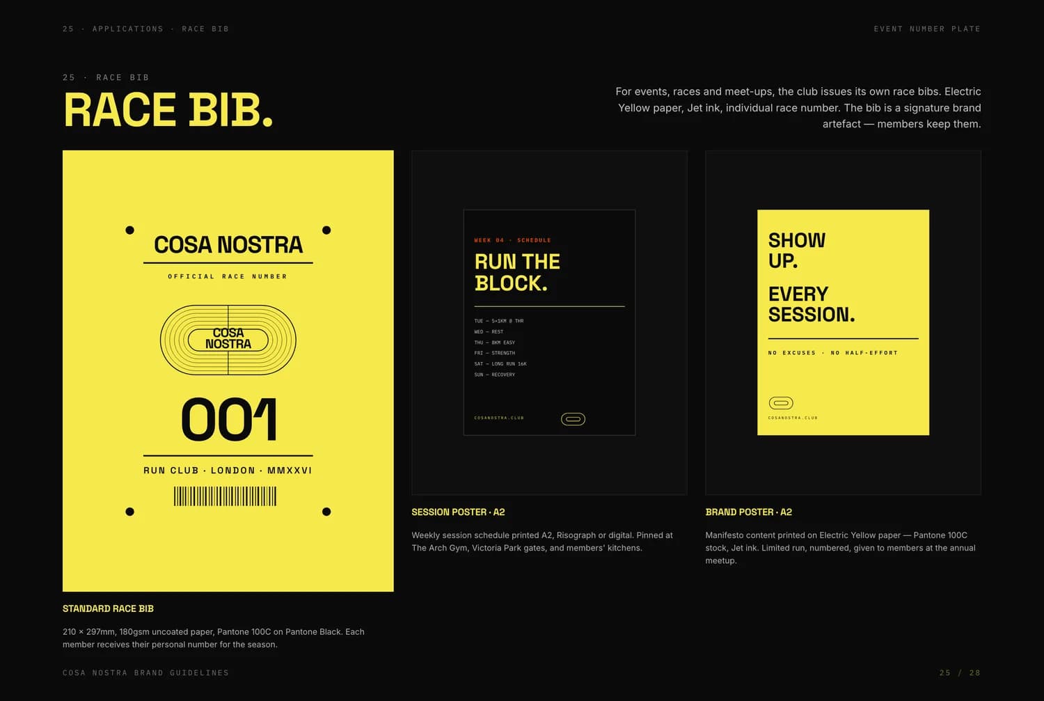
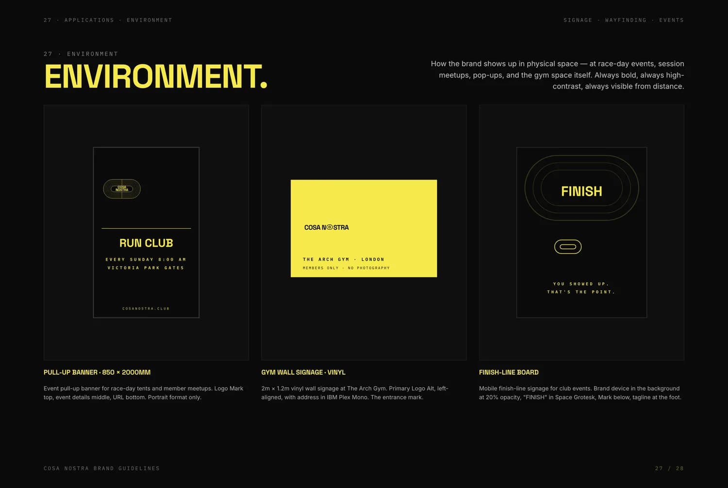
A complete system is not automatically the right one.
The key decision
Start again
Direction one was coherent and thoroughly specified, and it read as a track club.
The further it went, the more it committed to running as the subject, when the club is strength and conditioning with running inside it. Shipping it would have meant a polished identity for the wrong club.
The second direction started from a different premise: drop the illustrative mechanic entirely and let the letterforms carry the whole personality. No icon, no device, no accent colour to hide behind.
The final identity
One typeface, four marks, no decoration
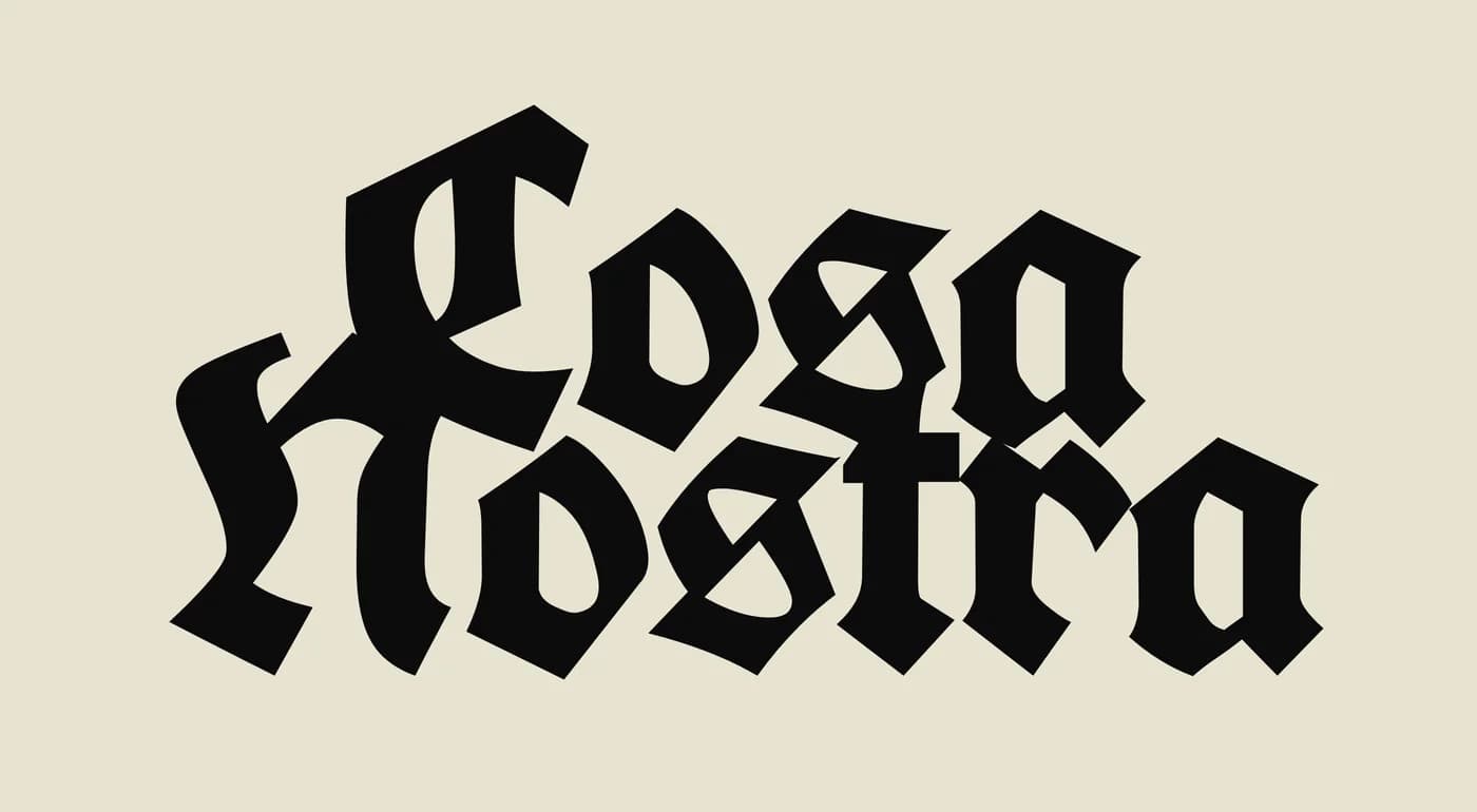
The locked system is built entirely from UnifrakturCook 700, a rounded fraktur that carries heritage and menace without the ceremony of formal blackletter.
- Off-white#F2EDDDPrimary fill
- Near-black#0C0C0CPrimary ground
- Cream#E8E2D0Paper goods
The Interlock
Primary wordmark. Cosa overlapping Nostra.

The Stack
Default monogram for avatars, labels and patches.

Side-by-side
For wide spaces where height is short.
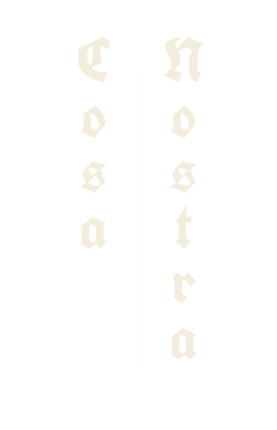
Vertical
Two upright columns with a rule between.
Delivered
Master artwork the club can use without us
Twenty master files: the four marks as transparent PNG, solid-ground JPEG and source SVG at 3000 pixels on the longest edge, in both colour treatments. The SVG masters recolour from a single documented value, so the marks stay usable after handover.
Two directions is not indecision
The first system had to be built out properly before it was obvious it was solving for running rather than for the club. That is what exploration costs, and it is cheaper than finding out after launch.
Constraint became the identity
Removing the icon, the accent colour and the device left the letterforms nowhere to hide, which is exactly why the final mark holds at patch size and at poster size.
Building something like this?
Tell us what you have in mind. You will get an honest view of scope, sequence and cost.
Next project
Resoled
An authenticated sneaker and streetwear resale marketplace, live on the web, the App Store and Google Play.